TALENTO
Building a modern human capital company
Talento is a modern human capital company, built to capture decades of expertise inside a single, professional talent brand. As a new venture from a dynamic global group with several successful exits in the space, the team turned to Ruckus to shape how the company would look, sound, and scale: naming, branding, design, and website development, end to end.
Design a modern legacy
The mandate was clear: capture decades of expertise and experience in a new brand, develop an identity, and prepare it for scale. The result had to feel established from day one, yet built to move as fast as the market it served, with a complete system of name, mark, color, and type ready for every touchpoint.
The positioning centered on a simple truth: it is people who make businesses run, and people who fuel innovation. Talento was built as the innovative human capital solution, integrating a tech-driven methodology to find the right talent for any organization, with every search treated with the rigor of a top executive placement.
A mark with reach
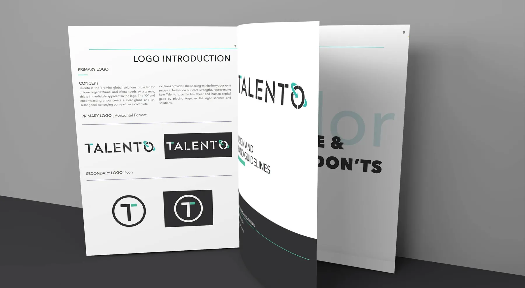
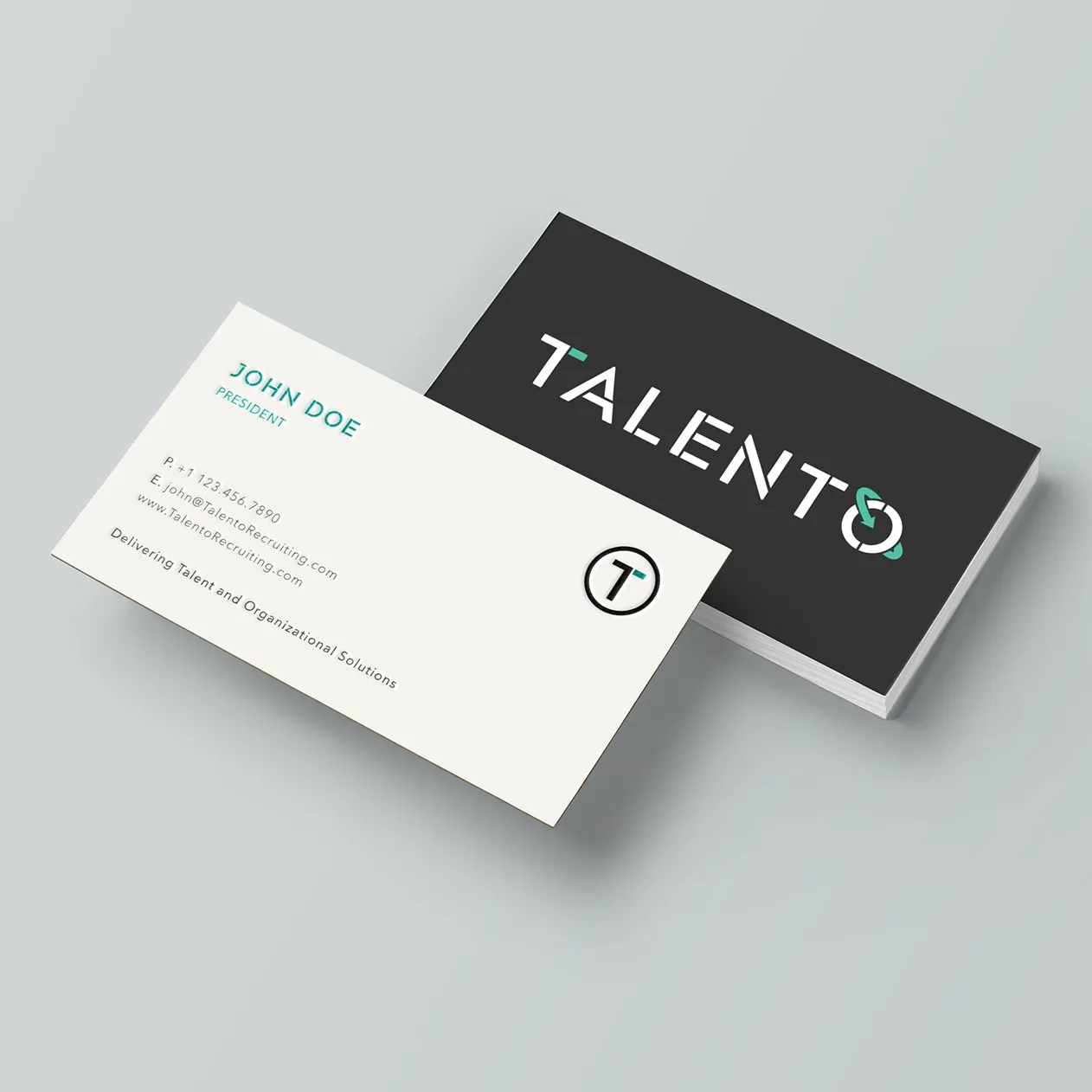
The wordmark is engineered in a sharp, stencil-cut geometry that signals precision. In the O, an encircling arrow forms a globe, conveying reach as a complete, global solutions provider, paired with a secondary icon, the T held in a circle, so the identity holds together at every size. Acherus Militant, a sleek geometric stencil, handles display work; Avenir Next stays legible and calm across web and print; and the palette holds to slate, seafoam, and white.
The identity shipped with a complete guidelines manual, positioning, logo construction, spacing and proportions, exact color codes, and typography, and it is as explicit about misuse as use: no tilts, no outlines, no drop shadows, no color swaps, no busy backgrounds. Clear space is measured off the mark itself, the height of the N for the wordmark, half the T for the icon, and a one-color system keeps the identity intact wherever color falls away.
A brand in motion
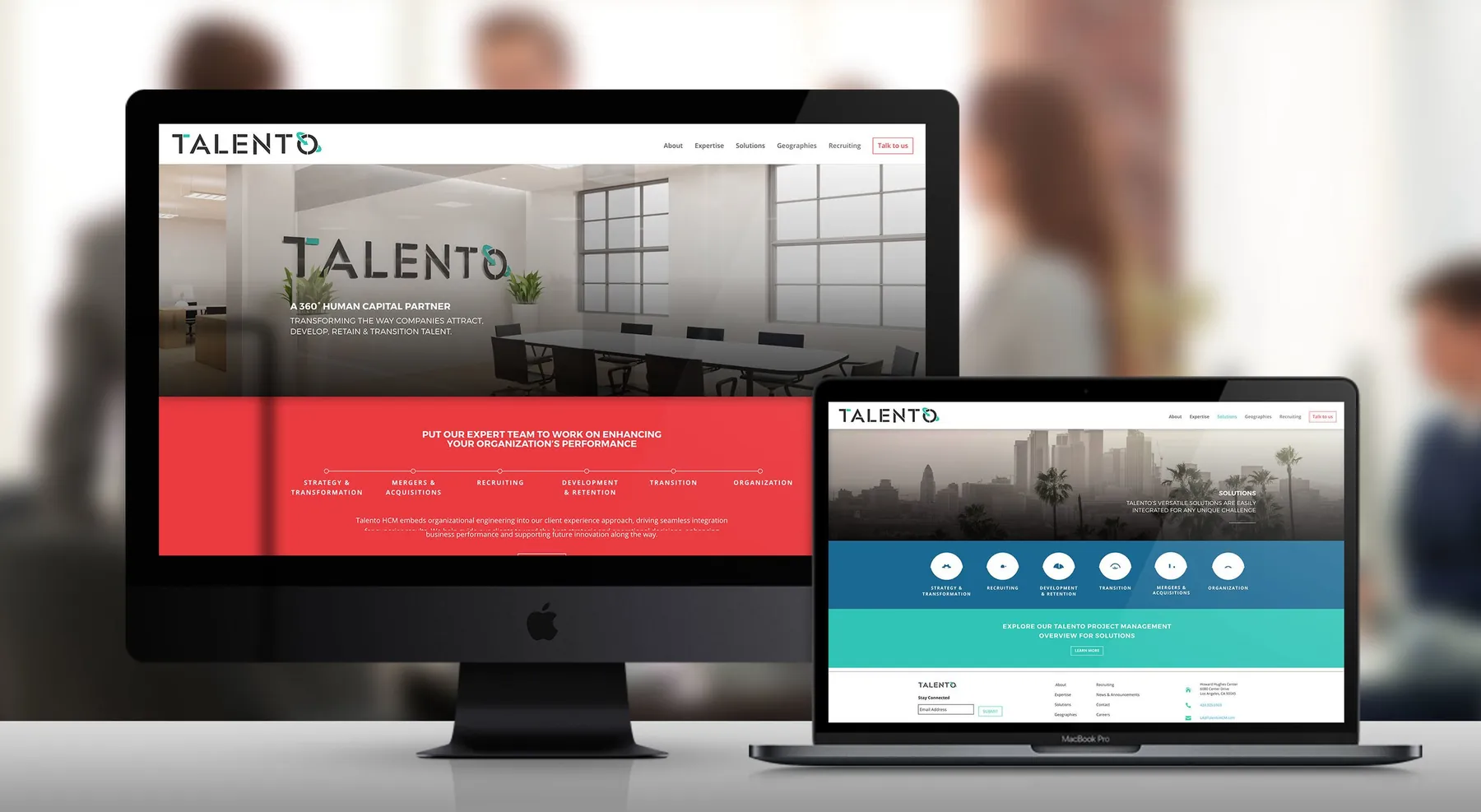
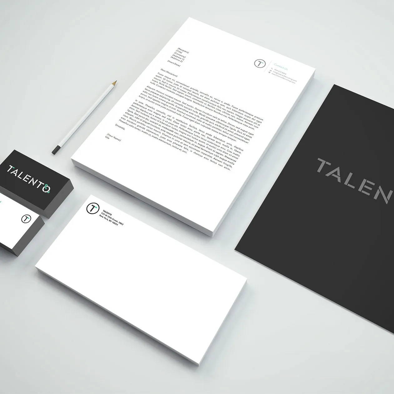
The rollout ran down to the letterhead: business cards, envelopes, notepads, social media skins, presentation templates, and a company fact sheet, each built from the same mark, palette, and type. Ruckus then replaced the existing site with a dynamic, responsive WordPress platform designed to generate lead interest and disseminate content as the company entered a mature growth stage, moving from MVP workshops and user stories through style tiles, wireframes, and high-fidelity screens to build and launch.
To launch the identity, Ruckus Studio produced an original brand film, Us vs Them, concept to final cut, bringing the new name, mark, and voice to life in motion and giving Talento a story to lead with as it scaled.
Built to scale, deployed in three months
A complete brand and the platform to carry it, named, designed, and launched in a single quarter: a new name and visual identity, a guidelines manual governing mark, color, and type, a responsive platform built for growth, and an original brand film. Talento went to market established from day one at talentohc.com, and has kept growing across new services and markets since.