

USADATA
Connecting all the dots
USADATA provides intuitive technology for businesses to surface customer insights and effectively reach ideal, custom audiences. A pioneer in data and software as a service, the company turns raw information into smarter, sharper customer targeting. Smarter Marketing. Superior Results. The trouble was that almost none of that came through: they struggled to succinctly explain all they do, and lacked a navigable website.
Hidden behind a dated identity
A sophisticated data business was hiding behind a dated identity and a site that made it hard to find, and hard to follow. USADATA tasked Ruckus with creating a clear brand identity and a modern web user experience, end to end, from copywriting and logo design through web design and development, so the depth of the business finally showed on the surface.


Grounded in evidence before design
Before a single pixel, the new brand was built on evidence: two brand workshops, thirteen stakeholder and client interviews, and a full competitive audit that mapped how USADATA really talks, works, and wins. The groundwork uncovered the target demographics and produced the personas that would guide the identity to come.
Every dot counts
The flat, serif wordmark became a modern mark built entirely from dots: warm, precise, and unmistakably about data. Like a pointillist painting, the mark builds the brand's initials from individual points, a symbol for a company that assembles countless data points into one clear, complete picture.
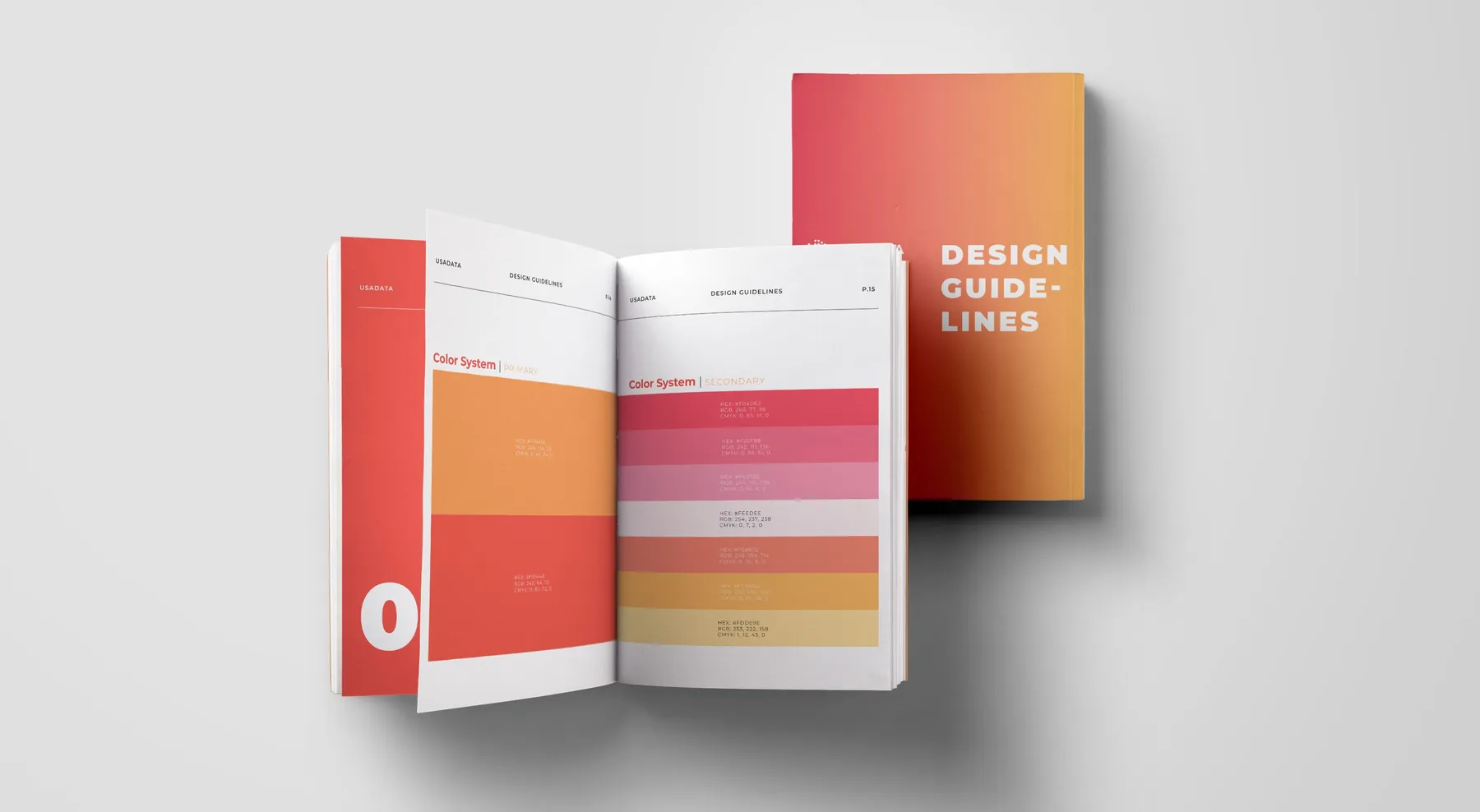
Warm oranges and confident reds give a data company something rare: energy. The precise color system is engineered to stay consistent across web, print, and product, and the typography is built on Montserrat, a geometric sans with the clean, engineered feel of a modern data platform, in nine weights from fine print to a headline that lands.
A site that finally explained everything
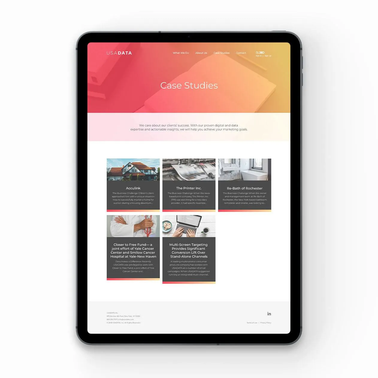
Ruckus rebuilt the digital experience from design through development, so the depth of what USADATA does became easy to find and easy to follow: copy and structure that state what they do in seconds, a path through the products built for how buyers actually look, and a look as current as the technology behind it.
USADATA now has a unified, distinct identity and a modern, easily navigable website, a powerful brand ready to scale. The system travels: on signage, the dot motif disperses across the wall like data finding its shape, and on apparel, the dots connect into a constellation, a quiet reminder that USADATA links single points into a bigger, usable whole.