THE CHEF'S GARDEN
A farm built for chefs
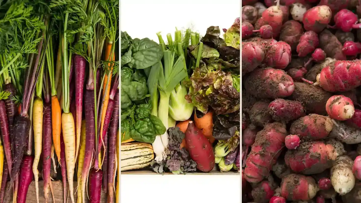
The Chef's Garden is a family farm in Huron, Ohio, on the shores of Lake Erie. Since 1958, the Jones family has grown specialty vegetables, microgreens, edible flowers, and heirloom varieties for the world's most discerning chefs, and increasingly for home cooks who want to cook like them. Its Culinary Vegetable Institute brings chefs to the fields where their ingredients grow.
The philosophy has not changed in four generations: grow for flavor, not for yield. The family farms the long way on purpose, harvesting by hand for the chefs who cook by instinct. Ruckus was engaged to rebrand and rebuild the digital home of the legendary farm, spanning brand strategy, visual identity, UX and web design, and e-commerce.
A reputation the brand had outgrown
Chefs revered the produce, but the identity and the website had not kept pace with the farm's stature. Two audiences, professional kitchens and home cooks, were served through a fragmented experience, and the brand language even differed between The Chef's Garden and its Farmer Jones Farm market. One farm had many front doors: chefs, home cooks, and the Institute lived in disconnected places, the identity undersold the craft behind every harvest, and the storefront made specialty ordering harder than it needed to be.
A brand as considered as the farming
The identity work began wide. Rounds of logo exploration put three distinct directions in front of the family, Sun Over the Fields, The Chef's Crest, and The Bow Tie, each developed as a complete system of lockups, badges, and colorways before any final decisions were made.
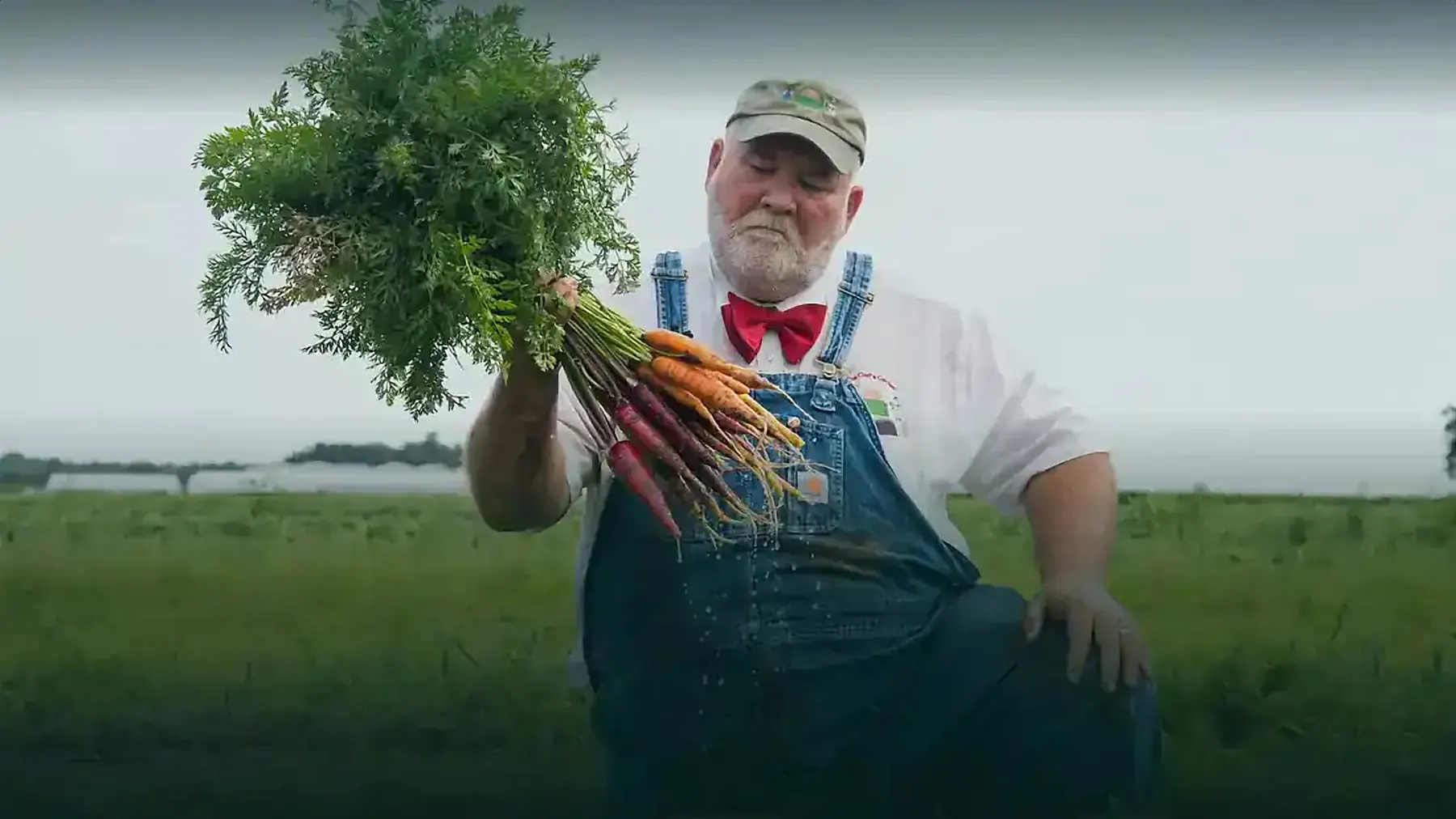
The refreshed identity carries the warmth and the rigor of the work behind it: a refined serif wordmark, a hand-drawn icon set, and Farmer Lee's signature bow tie, reimagined as the brand's own mark. An earthy palette drawn from the fields, dark green, gold, burnt orange, and bow tie red, pairs with Alexandria for headlines and Mulish for body copy.
One home for chefs and home cooks
Before a single page was designed, a full UX deep dive set the foundation: a hard audit of the existing site, research across premium farm and specialty food retailers, and a review of navigation and conversion best practices, distilled into a do's and don'ts cheat sheet for the build. A sprawling navigation consolidated into five core sections, Our Farm, Chefs, At-Home, Gifting, and Learn, kept sticky across desktop and mobile, with a full sitemap and breadcrumbs keeping every path consistent.
The new storefront serves professional kitchens and home cooks through one path to purchase, wired to the farm's own inventory so availability always reflects the fields. Subscriptions and recurring boxes, a streamlined checkout, online gift cards, the fresh vegetable donation program, and a deep FAQ library all speak one brand language, with recipes, farm events, and the Institute gathered in one place.
A heritage brand, brought fully into its own
Delivered as a multi-year partnership from brand strategy to a living digital experience. The complete identity system, logo, palette, typography, and the signature bow tie mark, is documented end to end for the family to carry forward, and the fields, the market, and the Culinary Vegetable Institute finally speak as one.