KIDS FOR KIDS
Hands around a heart
Kids for Kids Foundation is a community of friends, families, and colleagues raising money for organizations that support children and families facing medical challenges. Rooted on Long Island, the foundation turns golf outings, raffles, and family events into real support for children's hospitals across New York and beyond, including St. Jude Children's Research Hospital, Maimonides Children's Hospital, St. Mary's Hospital for Children, and Cohen Children's Medical Center.
A grassroots mission, without a system to carry it
The foundation needed a brand as warm and unified as its mission, and a system to keep it running across a full calendar of events. That meant three things: turning the simple idea of kids helping kids into one ownable symbol the whole community could rally behind, a system of color, type, photography, and motion the team could pick up and run on their own, and an ongoing engine of marketing, web, and content to brand every fundraiser on the calendar.
A ring of hands, a heart at the center
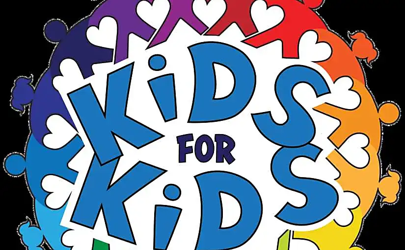
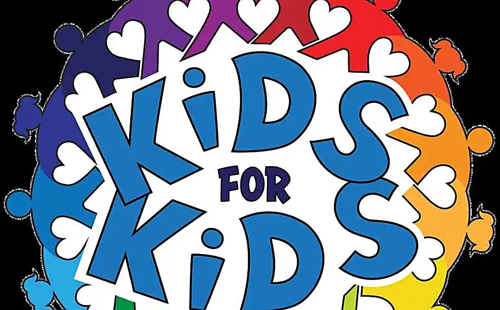
The heart of the identity is a ring of figures joined hand in hand: unity, and the teamwork it takes to fulfill the mission. Between the bodies sits a heart-shaped void, drawn from artwork donated at a Kids for Kids fundraiser, so love, care, and compassion are built into the form. The coloring is bright and full-spectrum, so everyone can see themselves in the circle, no matter their background.
Around the mark sits a complete system: primary and secondary lockups with program title lockups for every event, Crete Round and Source Sans Pro pairing a warm slab serif with a clean open sans, a minimal brand-colored icon style, and formatting, usage, and naming rules, from Kids for Kids to KFK, that hold the identity together in any volunteer's hands.
Real moments, never staged, never stock
Ruckus set a photography standard so every event looks like Kids for Kids: tell a story, capture moments, get close, use natural light, and keep it clear, with candid moments favored over posed group shots and no stock imagery, ever. A branded Premiere motion package, general intro, events intro, lower third, and logo reveal, lets editors drop templates in so every event film carries the identity from the first frame to the final logo reveal.
A brand built to be handed off
What began as a rebrand grew into an ongoing marketing and production partnership: rolling 30-day action plans mapped to the events calendar, social consulting across Facebook, Instagram, and LinkedIn, event and raffle landing pages built to convert, email templates for outreach and appeals, promo and recap films for each event, hero speaker films that put a face to the mission, and a year-in-review recap, keeping the same bright, unified brand live across every fundraiser on the calendar.