HOMEDICS
The beauty of living well
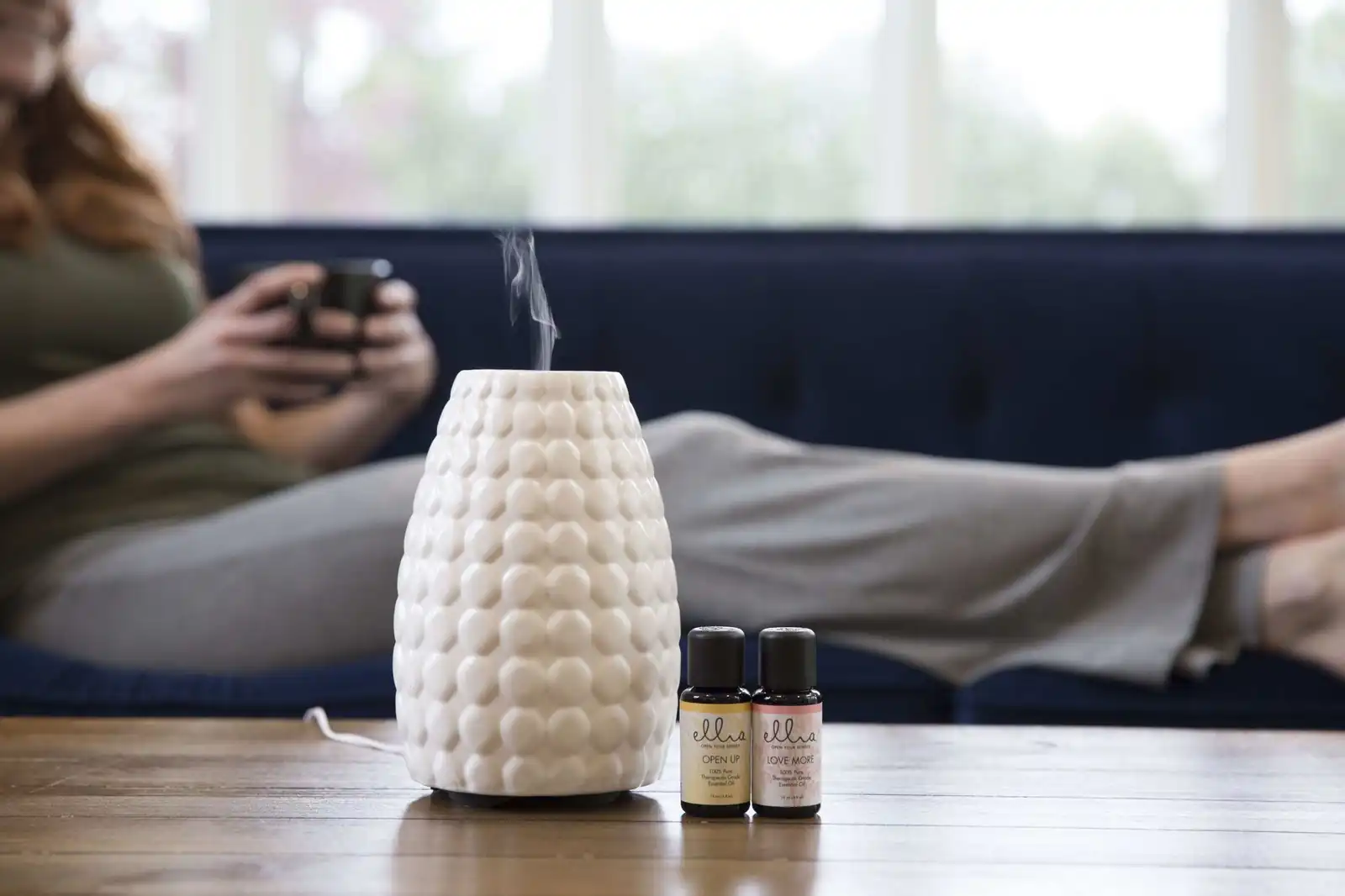
HoMedics is a leading global manufacturer of health and wellness products, helping people relax the body, de-stress the mind and promote well-being through massagers, air purifiers, humidifiers, diffusers and home spa products. For more than 30 years the family-owned company has pushed for progress in the consumer wellness and electronics spaces, growing a portfolio that spans HoMedics, Ellia, The House of Marley, Sol Republic, HMDX Audio and JAM Audio, across a twelve-country footprint from the USA, Canada, Mexico and Brazil to the U.K., Italy, Australia and South Korea.
Six brands, one corporate parent
Ruckus was engaged to offer strategic consultation, rebranding and messaging as the company prepared a pivot: uniting its family of brands under a new corporate identity, from mission and story to name and mark. Define who the corporate parent is, the mission, vision, promise, values and culture that hold a family of brands together. Explore, name and craft a new identity, refined into finished marks, guidelines and business essentials. And give the company a voice, an external message consumers can feel and an internal message employees can rally behind.
Every product measured by a single question
The mission came down to making sense of innovation, with every product measured by a single question: will this make lives better? Around it, Ruckus articulated a vision, a promise and five values, innovation, employees, efficiency, initiative and collaboration, giving the family of brands a shared way of working from the design bench to the boardroom. The external message distills the mission into three words consumers can feel in every massage, scent and song, while a companion line rallies the team inside the company: The Best You Creates The Best Us.
Soundwaves, fingerprints and woven patterns
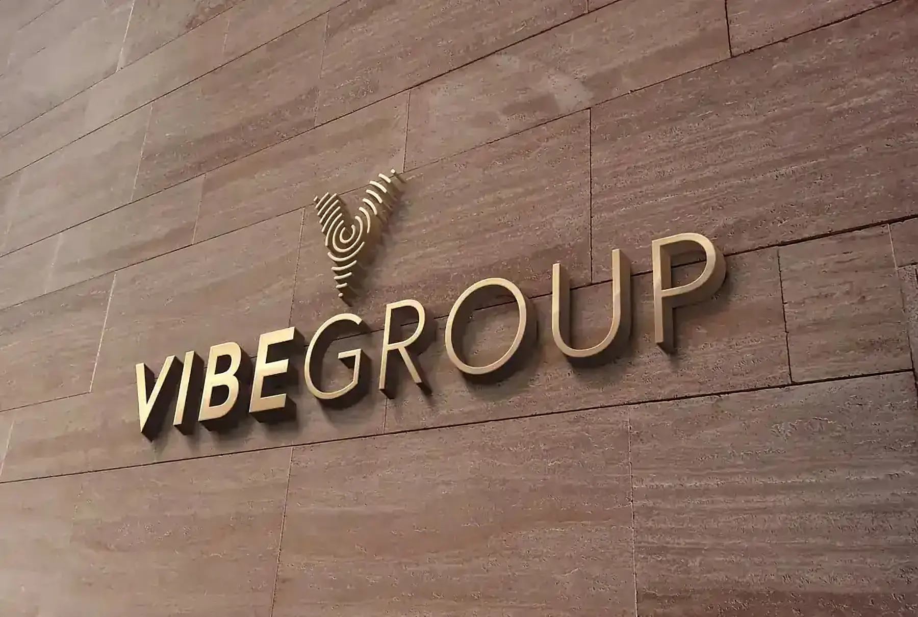
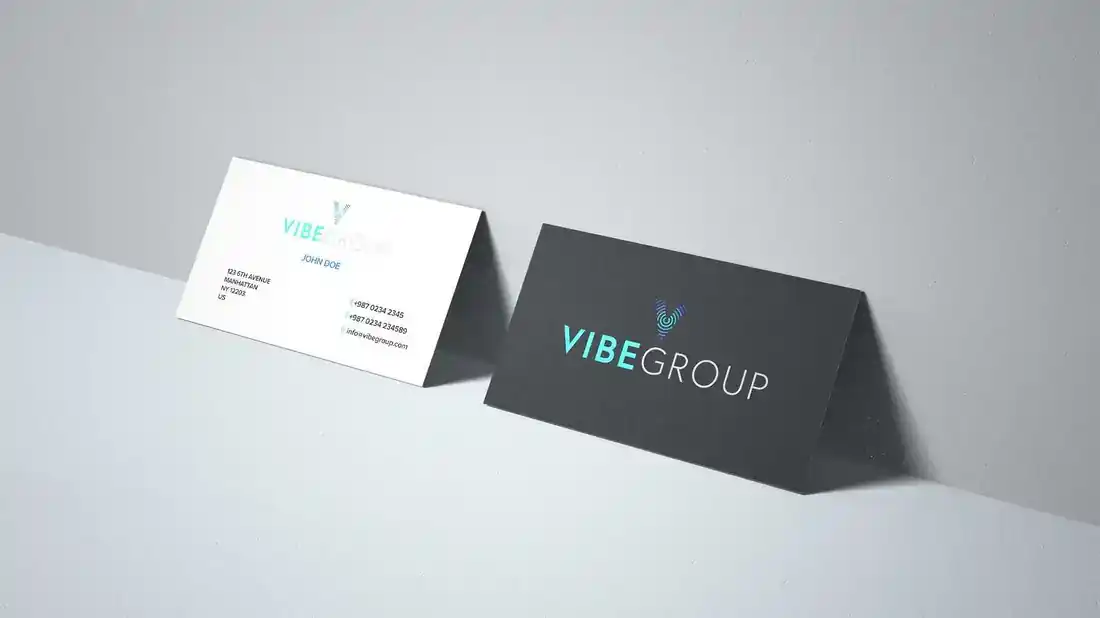
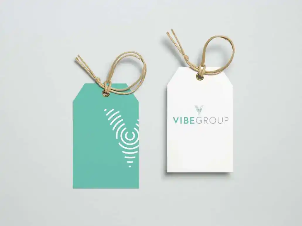
The identity exploration ran wide before it ran deep. Two naming directions led the work, FKA and Vibe Group, with concept marks that turned letterforms into soundwaves, fingerprints and woven patterns, different ways of saying wellness, sound and sensory innovation. The Vibe Group brand book locks the system to a signature teal balanced by two neutral grays, with Avenir for headers and Montserrat for body copy, chosen because it stays modern, minimal and legible whether it is blown up on a wall or shrunken onto a label.
Two finished identities were refined and delivered. The FKA monogram carries a soundwave pulse in its final letter, while the Vibe Group logotype radiates the same signal from its V in the brand's signature teal. Letterhead, envelopes and business cards made the identity operational from day one, packaging concepts flash the teal from the shelf, hang tags prove the soundwave V can stand entirely on its own, and dimensional signage carries the logotype off the page, ready for the lobby wall of a global family of brands.
A rebrand package, ready to roll out
Using market research, strategic insights and finished design and messaging, Ruckus delivered a package of information, assets and guidance sufficient to conduct a complete rebrand: the strategy defined, the identity crafted, and a six-brand family across a twelve-country footprint ready to roll out with confidence in every market it serves.