BROOKLYN FIBER
The new standard, fourteen years in
Brooklyn Fiber is a fully independent, locally rooted internet service provider founded in 2011 by brothers Rob and Eric Veksler. Serving residential and commercial customers across metro New York, it delivers symmetrical, ultra-low-latency internet with 99.99% uptime, flat pricing for life, and no contracts, the kind of service the big providers stopped offering long ago. Fourteen years in, the brand no longer matched the infrastructure, and Ruckus was engaged to rebuild the identity from strategy up, one that projects utility-grade confidence without losing its street-smart, human soul.
Standing beside giants, without shouting
New York's internet market is controlled by a few giants, and customers expect slow installs, hidden fees, and call-center runarounds as the norm. That trust deficit is the incumbents' own making. Brooklyn Fiber's fourteen years of 99.99% uptime and Hurricane-Sandy-proof resilience were wrapped in an identity that read smaller than the infrastructure behind it. The easy move was the scrappy anti-corporate rebel; the brief demanded the opposite, confidence over rebellion, a utility that has already earned its place.
Five pillars, one standard
Ruckus defined the mission, vision, and five brand pillars. Independent by nature: built without asking permission, free from the grip of the telecom giants. Essential performance: 99.99% uptime, symmetrical speeds, and rapid deployment. Smart simplicity: no bundles, no fine print. Human support: real people behind every install, backing service when things go wrong. And Brooklyn-built confidence: local credibility fused with infrastructure-grade performance. The story landed on one line, the new standard in internet, built quietly and correctly and delivered by real people.
Built for the street
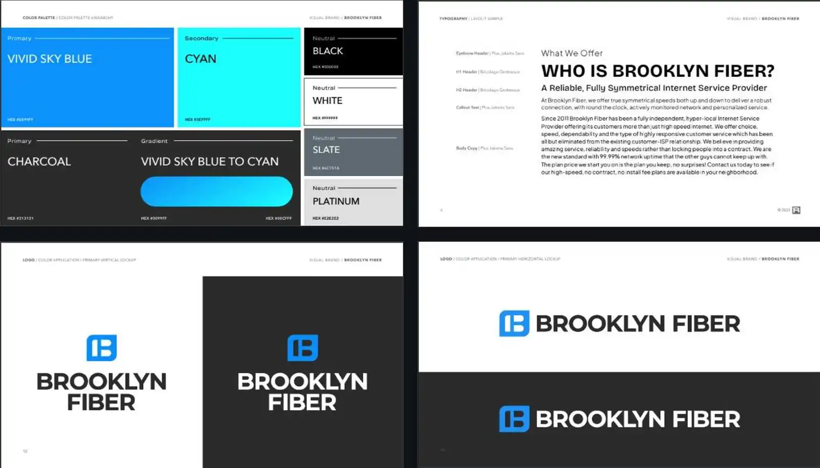
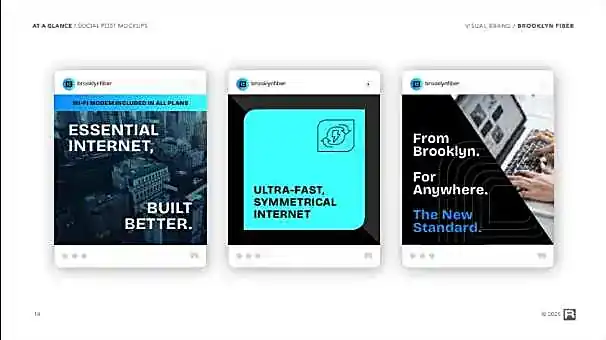
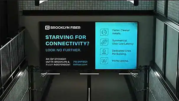
Around the pillars Ruckus built a complete visual system with bold Bricolage Grotesque headlines and a Vivid Sky Blue to Cyan gradient. It was made to flex from subway platforms to social feeds, with street-smart copy that sells performance without the hype. Built for the street, it reads as a utility that belongs beside the giants without shouting, and every touchpoint carries the same message: this is the new standard.
The network delivered, now the brand does too
Ruckus delivered a complete brand platform, strategy, story, pillars, voice, and a full visual system, shipped in one engagement and rolled out across street, social, and digital, from subway billboards to the feed. The full platform, from strategy through guidelines, gave a fourteen-year-old ISP an identity to match its network. The result finally lets fourteen years of engineering credibility do the talking. The network always delivered; now the brand does too, built quietly and built correctly.