User Experience Design in the Age of Mobile
In a rapidly changing industry, only the adaptable survive.
By Madelene Eng
Thirty years ago, web design didn’t exist. Today, it is a sector still in its infancy. Like any infant, it is subject to rapid changes and developments. As UX/UI designers, we must be as adaptable as the industry is fluid. While platforms continue to quickly expand and multiply, we must shift our design tactics to match and maintain a user-friendliness that mimics the desktop experiences we once considered our only responsibility.
What does this mean for UX/UI designers? Whether we consider our jobs business or art, the mobile age brings more challenges for us to tackle. There is no one-size-fits-all approach to design, and no desktop website can be seamlessly transmuted into mobile or tablet without losing something – especially not as users become more accustomed to new technologies and are trained to interact with them in specific ways.
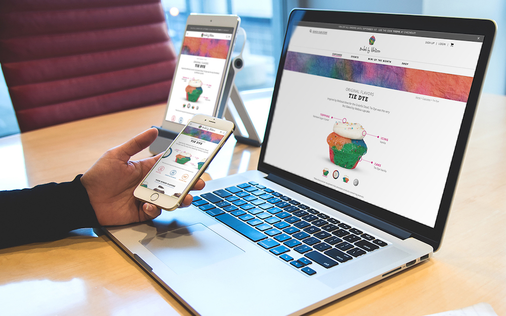
For example, take a website that’s built for desktop but is accessed on mobile. Is there a hero image? If so, its dimensions probably went wonky. That blurb of copy under the image, just two or three lines on your laptop, now takes a downward scroll or two to pass. And below that, what was once an orderly grid of product imagery is now a jumbled stack of photos and copy that one’s eyes don’t intuitively navigate. We as users have adapted to the subtle differences in our devices and learned behaviors accordingly; whether we realize it or not, our eyes, fingers, and brains have developed certain device-specific expectations. When those expectations are defied, we’re left with a tinge of confusion, even anxiety, that makes us much less likely to revisit that site in the future. It is for these reasons that more platforms inherently create more work for UX/UI designers. The language of mobile has differentiated itself from the language of desktop, and we must translate the story of our clients’ brands into multiple, distinct formats.
While multilingualism is a challenge in and of itself, the real difficulty of UX/UI in the mobile age is not learning how to design for mobile; it is finding the time to do so. With over half of web traffic to leading sites now coming from mobile devices, practically every site we build requires a fully designed mobile experience. Despite some overlap in the process of designing a single website for desktop and mobile, that process is actually closer to two separate projects than it is to one. Essentially, the mobile age has doubled our workload.
Now, it’s not all bad. Mobile design is not just a chore. Used correctly, it is a tool with the power to complement a brand’s existing presence, tell its story in a new way, and sustain accessibility for users on an essentially permanent basis. Used incorrectly, however, it can break relationships. If you are anything like the average user, when you visit a mobile site that is clunky, slow, tough to navigate, overwhelming, or even just slightly frustrating, you hold it against the company and lose faith in its quality. With the level of digital competition that exists today, writing off sites for minor imperfections is your prerogative.
So, we as UX/UI designers must strive for perfection – we must recognize that mobile design is no longer optional, and we cannot simply focus on desktop and expect the results to translate sufficiently to mobile. We must communicate to our clients and teams the importance of mobile and the additional time and effort it entails. And, just as we get the hang of it, we should expect the web design industry to shift entirely once again.